7 Interior Design Mistakes to Avoid In Your House According to Experts

7 Interior Design Mistakes to Avoid In Your House According to Experts

Decoration and Design
Additions and Remodels
Cabinets and Countertops
By Contractors.com Team July 16, 2021

If you are planning to build a new house or remodel your old one, you’ll find that there are many home interior design trends to choose from — from classics such as Victorian interior design to more contemporary trends such as minimalism, and all the fusions between. But regardless of which trend you choose to go with, there are some universal interior design no-nos that you’d do best to avoid. 

These interior design faux pas can upset the journey your eyes take in an interior and cause details to jut out jarringly, rather than work together to create something harmonious. A good interior design is defined by completeness, balance, and a pleasing aesthetic. By contrast, these mistakes could leave your interior design looking incomplete, imbalanced, or even unpleasant to look at. Happily, understanding these common mistakes is part of interior design 101. 

Some interior design choices can enrich a space and some are unfortunately duds and you can mark them as design mistakes that are easy to avoid. 

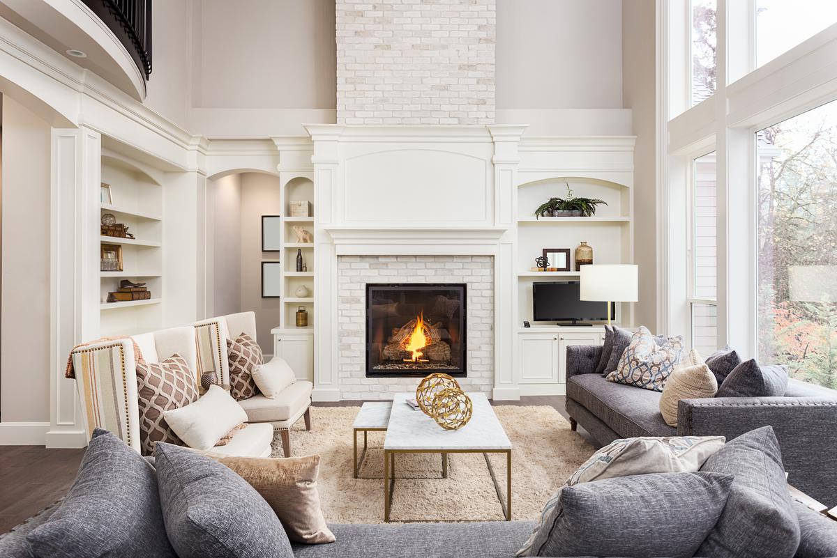
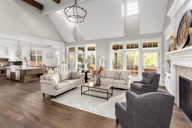
Too Much Furniture

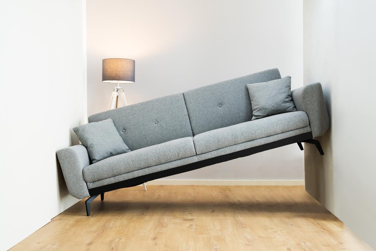
With so many bespoke pieces of furniture to choose from, it’s tempting to fill a newly built room with lots of sofas, armchairs, coffee tables, bookshelves, ottomans, and the like. But the important thing to remember is that you should avoid going too far with furniture.   

A few nice pieces of furniture can really accentuate the character and elegance of a space, but too much furniture can really mess up the aesthetic you’re going for. Too much furniture can cause barriers in an open space.  It can also become an annoyance since too much furniture causes clutter and makes a room feel more cramped. Even the most beautiful furniture will lose some of its luster if it feels like you can’t move around without constantly bumping into things. With any interior design style, you want to keep some open space so that your house feels airy rather than restricted and uncomfortable. And finally, with more items competing for attention comes more opportunity of losing the visual harmony in a room.
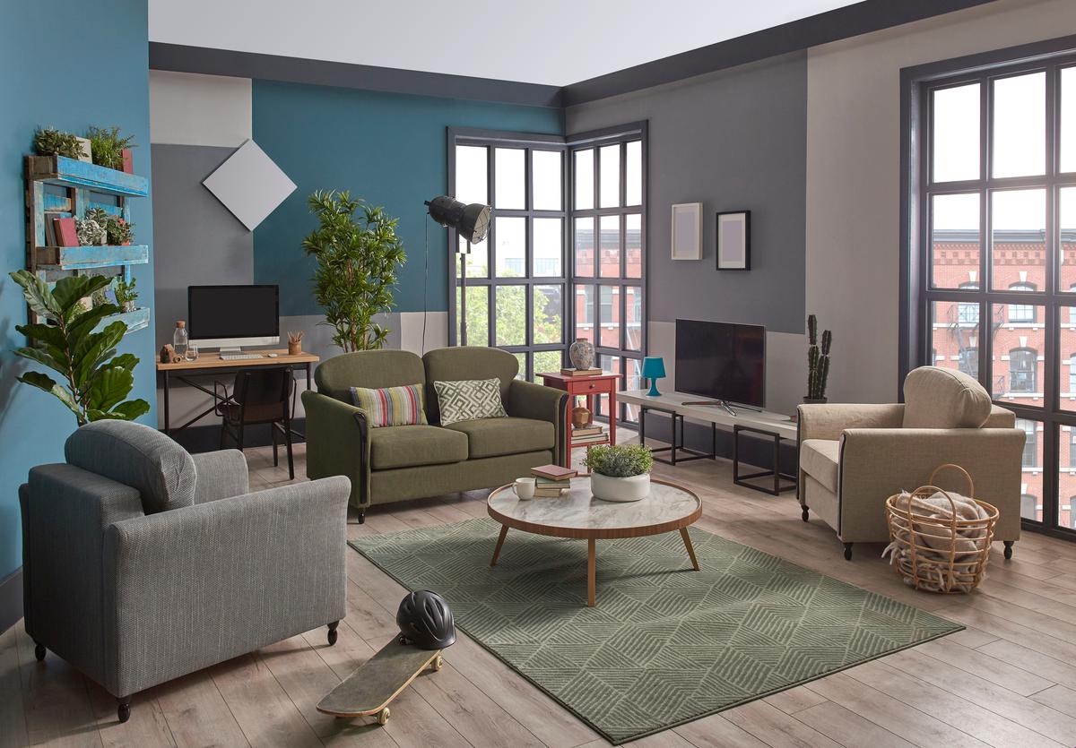
Room Layout and Making the Best of Minimal Furniture

Room Layout and Making the Best of Minimal Furniture

Installing Curtains Incorrectly 

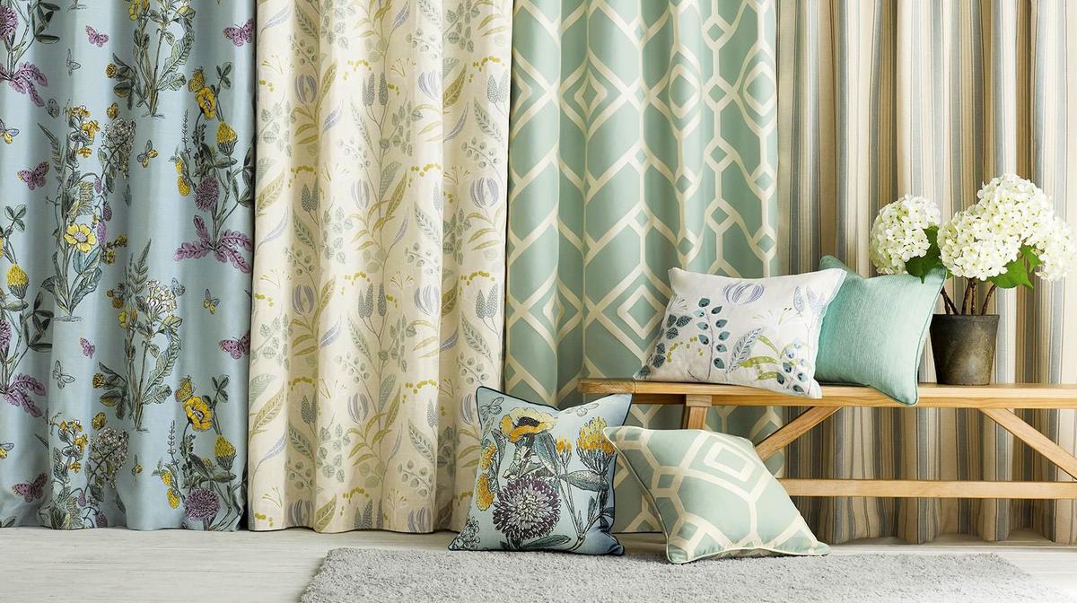
This seems like a minor detail, but it can really make a big difference in how a room looks and feels. If curtains are installed with a track that isn’t wider than the window itself, you can end up taking away some natural light from your space and obscuring beautiful window designs. If your curtains are too short, they may end up looking tacky and unprofessional, and most importantly, will take away from the height of your ceilings. Short curtains also lack functionality since they won’t be able to give you much privacy. 

Alice Chiu’s (a San Francisco-based interior designer) tip for proper curtain installation is: “Make sure drapes or curtains go all the way to the floor. Keep them 1/4” above the floor or as close to touching the floor as much as possible, but no higher than that.” This is pertinent advice since getting curtains that are too tall can lead to your curtains dragging across the floor. This can either look tacky or really ethereal, but it’s not easy to get just right. 

Mistakes That Homeowners Make With Curtains

Mistakes That Homeowners Make With Curtains

If you’re looking to keep a low budget for your remodeling project you might be tempted to save money by buying cheaper curtain fabrics. This however is a cost-cutting measure best avoided if you can because it won’t pay off in the long run. Low-cost curtain fabrics tend to look like they’re from the previous century. They usually feel rough and unpleasant to the touch, and won’t offer the same functionality as a curtain made of high-end fabrics.   

Too Much Or Too Little Interior Lighting

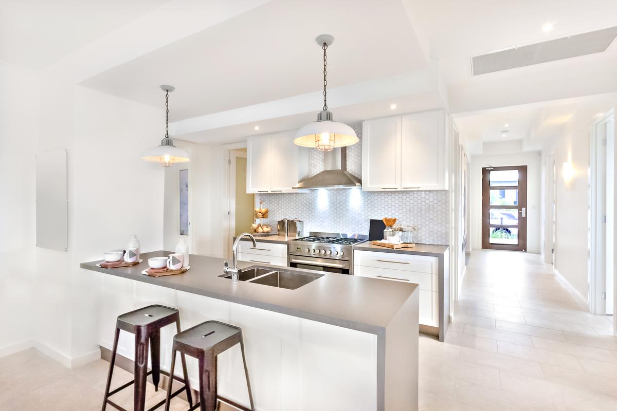
Interior lighting is a big component of how space will feel and function. Too many lights - especially too many of a single type of light - won’t do much to meaningfully increase illumination and will give your ceiling a cluttered look that will conflict with most aesthetics. For example, canned lights are super handy for lighting a room that doesn’t get much natural light, and are perfect for imparting a modern vibe to your interior. 

But too many canned lights might end up giving your ceiling a sort of “swiss cheese” look which can detract from a sleek simple aesthetic. Instead of going wild with canned lights, consider adding other types of lights to the same room. For instance, a room with canned lighting can also have a few sconces, accent lighting, and even some up-lighting. This will do a better job of lighting up the space and will also give a layered effect that makes light placement look elegant and deliberate rather than random. 

Making the Most of Natural Lighting In a Room

Making the Most of Natural Lighting In a Room

Too Many Plants 

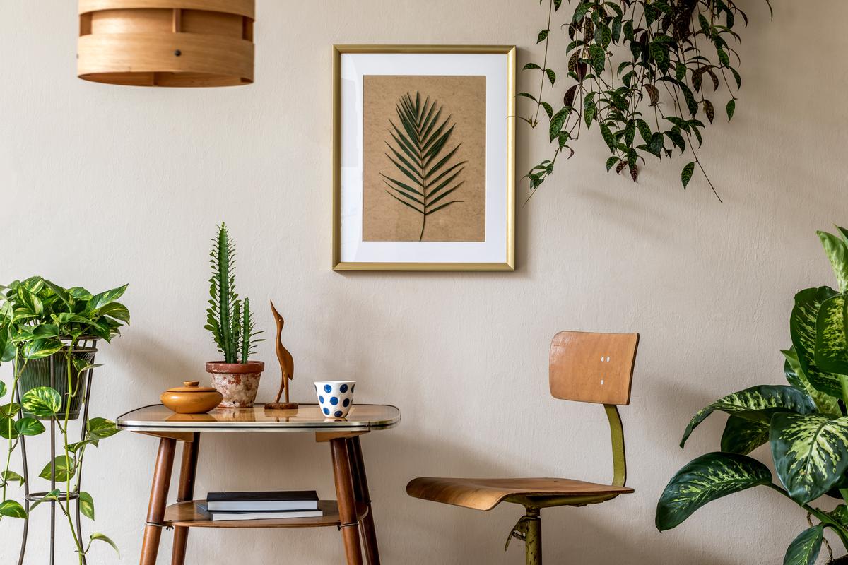
If you’re a fan of biophilic interior design, you know that one of the best ways to bring some nature into your home is to have some indoor plants. Plants help to purify interior air and bring vibrant colors to your home. But if you go too far, too many plants in one room can lead to some unintended negative consequences. Andra DelMonico, the lead interior designer for Trendey, a home interior design magazine, knows this best of all and has some pointers on how to avoid cramming too many plants in one space: 

“Several plants in one space can close the room in, especially if they vine or are tall. Don’t give up on your plants. Instead of having them all in one room, spread them out. Choose plants that fit the size of each room. A taller ceiling can support a taller plant. In contrast, a smaller room would do better with a small potted plant.” 

Easy to Grow Indoor Plants

Easy to Grow Indoor Plants

Making Things Feel Small

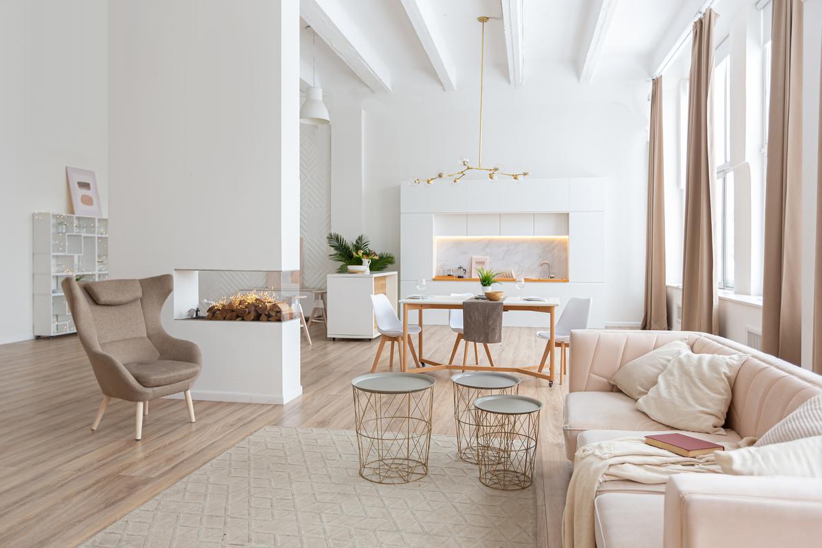
DelMonico also had some more pointers for avoiding design choices altogether that make the room seem small or cramped. She warned against jumping on the bandwagon of having visually divided floors, especially if your house is on the smaller side: “Smaller layered rugs are popular right now, but it’s a terrible idea for many homeowners. It creates several lines breaking up the floor and making it look smaller. Choose a large rug that more closely matches the color of your floor. This allows the rug and flooring to blend and eliminate the choppiness.” 

Tricks to Making Smaller Room Feel Bigger

Tricks to Making Smaller Room Feel Bigger

But for those that still want to bring the classy layered look into their home, DelMonico recommended opting for larger rugs over smaller ones, since large rugs will have fewer visual breaks and therefore will avoid cramping the space. 

How to Locate and Emphasize a Room's Focal Point

How to Locate and Emphasize a Room's Focal Point

Another big thing that can make things feel small in your home is when all your furniture is put against the wall. This will leave the center of the room blank, taking away any depth from your interior design. Ironically, by having so much free space in the center of a room, that room will end up feeling even smaller than it really is. The solution is therefore to avoid putting all your furniture up against the wall. Instead, you want to aim for a floating effect where furniture is not right up against walls. This will make the space feel more balanced and airy. 

Too Few Power Outlets

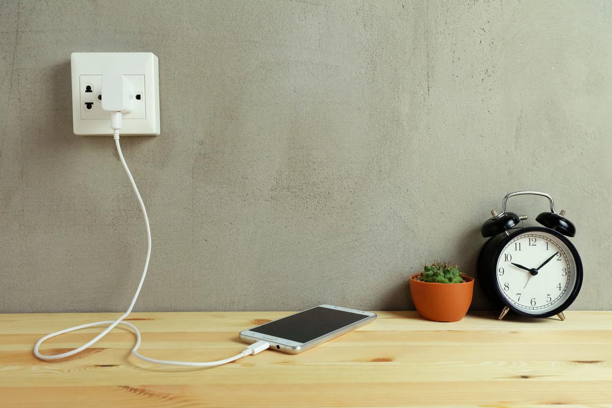
In this digital age, we’re using more and more rechargeable devices in our daily routines. Smartwatches, tablets, smartphones, laptops, power banks, headphones, bluetooth speakers, and even electric cars are becoming more and more common. All these things need a place to charge, so having enough power outlets is more essential now than ever. So it’s important when building or renovating to take this into account. 

It may be tempting to save money and put in as few power outlets as possible, but you’ll miss the practicality in the long run. As Alexander Zin of the Oliver Wicks home renovation firm says, you can never have too many power outlets:

“Well, nowadays with multiple electric devices, having a sufficient number of sockets is essential. The unwritten rule goes as follows: Have one at every 6.5 ft. (2m), and invest in double sockets – the price difference is negligible, trust me one socket in every corner is not enough.”

Picking The Optimal Spots for Your Outlets

Picking The Optimal Spots for Your Outlets

You should also buy power sockets that support USB and USB C connectors, and should absolutely get ground fault circuit interrupters (GFCI) so you have protection against water spilling onto sockets. In other words, don’t skimp on power outlets, because they’re a worthwhile investment in making you safer and never fighting for charging time.

Making Things Too Uniform Or Too Contrasting

This rule applies especially to the paint colors you choose for your room. Making things too uniform can have a real negative effect on the appearance of your home’s interior. Make things too monotone tends to leave a room uninteresting and soulless. A room that has too much uniformity will come off as one that is lacking in character and doesn’t tell a story. Rob Abrahams, co-founder of UK-based COAT paints, echoes this point, advising against the overuse of neutral color schemes: “[...] even the most impactful of neutral colour schemes include an accent colour of some sort. Whether it’s a strong black for artwork or furniture to create a Japandi vibe, or an injection of green from houseplants or artwork. Even neutral schemes need a pop of contrast colour to work.”

Finding the Balance Between Order and Chaos In the Living Room

Finding the Balance Between Order and Chaos In the Living Room

However, Abrahams also warned against using too many colors: “tick to the 60-30-10 rule for creating balanced colour schemes. Choose a main colour for the walls, roughly 60% of the space. Then a secondary colour for the floor and/or ceiling. Finally, choose a contrast accent colour for artwork or soft furnishings for that final 10%.” Putting too many different colors in one space can give a space an unrefined aesthetic that looks confusing and even chaotic. Too many colors mean too many details jumping out, which can exhaust the eye and make the room feel like it’s just too much. The key, as Abrahams notes, is to balance interior colors.   

Written by
Contractors.com Team

Written by Contractors.com Team

Welcome to the Contractors.com Team, a group of passionate individuals dedicated to helping homeowners achieve their dream home through the best-in-class service providers and inspiring content.


We believe that every homeowner deserves to have a home that they love, and we're committed to making that a reality. Whether you're looking to remodel your kitchen, renovate your bathroom, or build your dream home from scratch, we've got you covered.


When it comes to creating content, we take a multi-faceted approach. We gather insider tips from experts in the home service industry, and do our own thorough research to write informative and engaging articles that are tailored to our readers' needs. At the same time, we harness the power of A.I. and GPT-3 technologies to generate titles, headlines, and even entire articles that are optimized for SEO and designed to provide value to our readers.


We're committed to providing the best possible service to our readers, and we're always looking for ways to improve. Whether you're a homeowner looking for inspiration or a service provider looking to join our network, we're here to help you achieve your goals.

comments