5 Elements of Modern Kitchen Design

5 Elements of Modern Kitchen Design

Kitchen
Kitchen Remodeling
Interior Design
By Alex Mikayelyan April 06, 2022

Kitchens feature among the most state-of-the-art elements of modern interior design. From the high-tech appliances to the way the space is optimized to not only be functional but also comfortable, you’re going to spend a lot of time designing your modern style kitchen. Before you start considering the numerous options of kitchen appliances, interior decor, and wall paint, there are certain fundamental elements of modern kitchens to consider for each style out there.

All this may seem a little too much at first glance, but when you divide the kitchen interior styles accordingly and understand what each design requires to pull off a successful vibe, you realize that there are 

1. Farmhouse

Rustic Comfort of Farmhouse Kitchens

Rustic Comfort of Farmhouse Kitchens

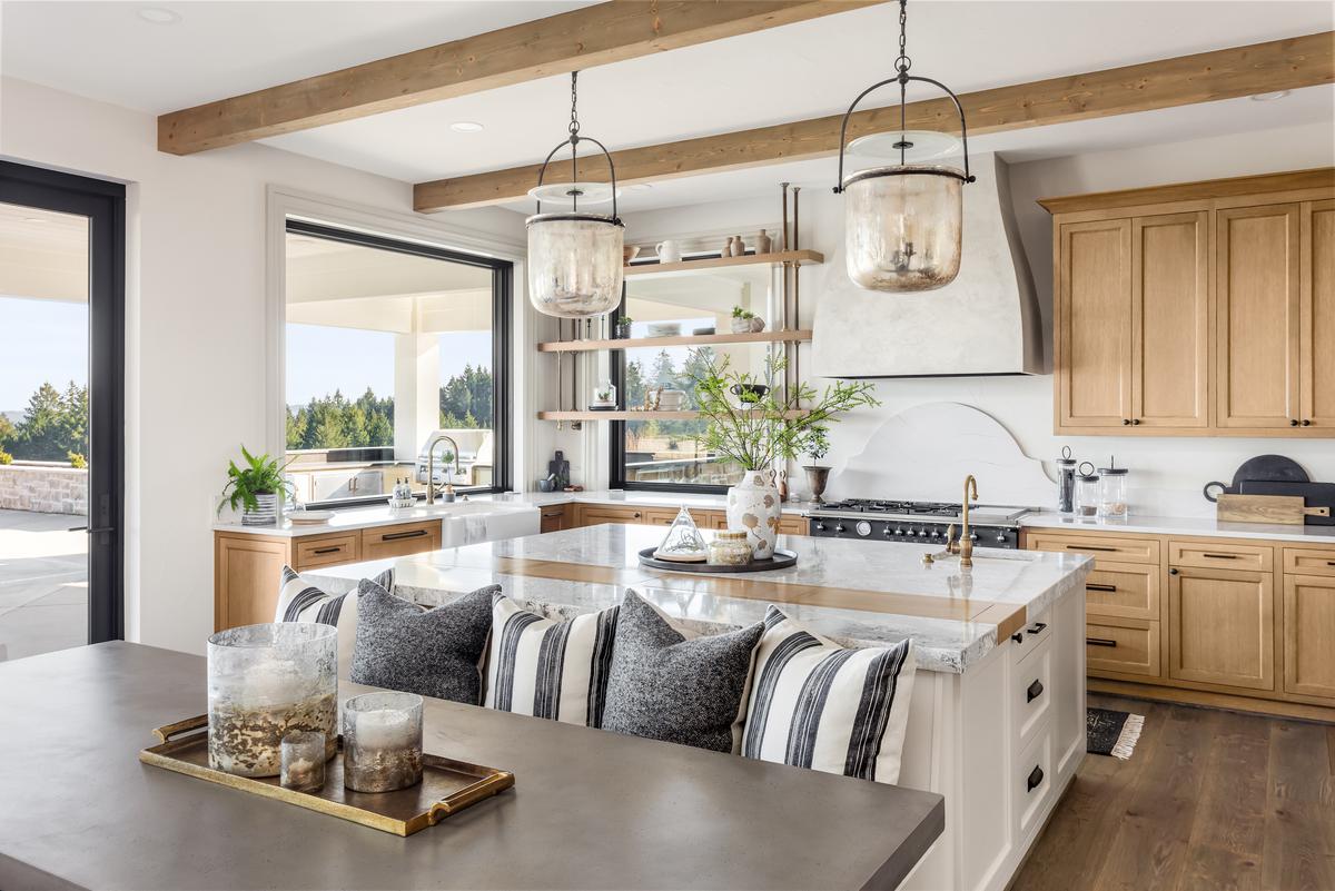
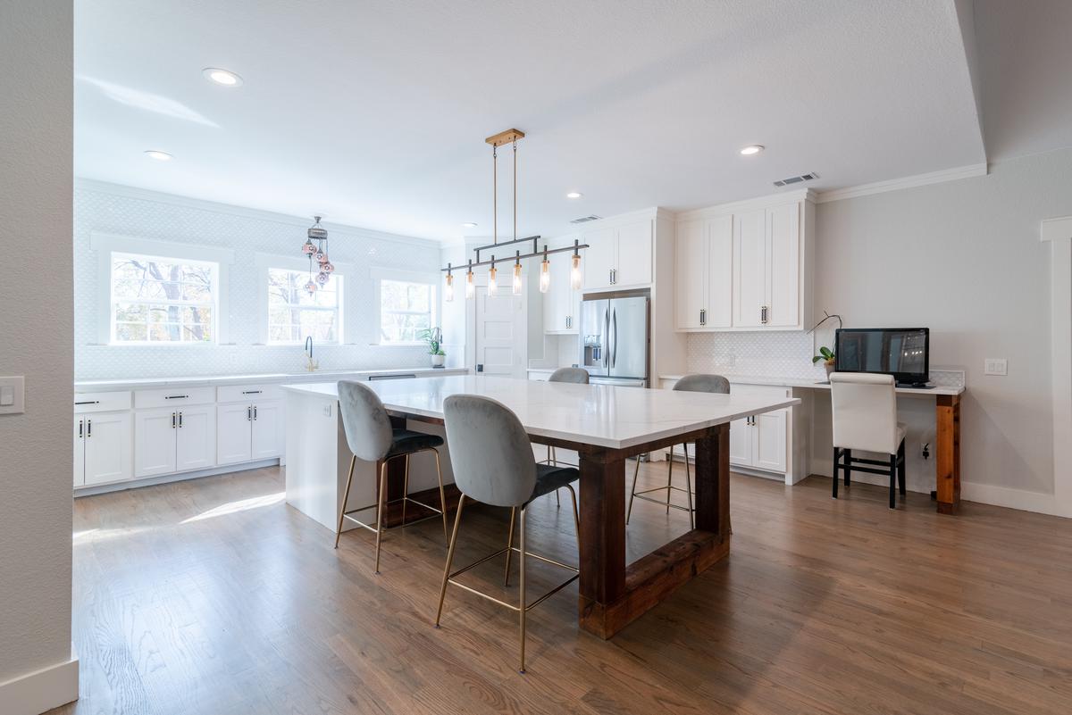
Rustic delight is easy to come by with a farmhouse-style kitchen. Modern rustic farmhouse kitchens are a great way to break up the monotony of contemporary interiors, which tend to be minimal and simplistic, prioritizing practicality over detailed interior elements. What makes farmhouse interiors so great is that their designs were born out of convenience. 

For example, a dining bench works much better in farmhouse interiors and offers more practical seating as opposed to individual chairs. This way, with a single bench, you can seat some people, instead of having to find a separate chair for each one. This works quite well in small modern farmhouse kitchens where there may not be enough room for multiple dining chairs.

Another crucial element in the roster of modern farmhouse kitchen ideas is wood. Being a more rustic interior, modern farmhouse kitchens will primarily rely on wooden textures to adorn various surfaces of the kitchen. From a live edge table to reclaimed wood accents, and rich brown cabinets; all these interior elements bring the kitchen together and give it a charm that is unrivaled by many kitchen contemporary design ideas. 

2. Coastal

The Bright Blue Interior of Coastal Kitchens

The Bright Blue Interior of Coastal Kitchens

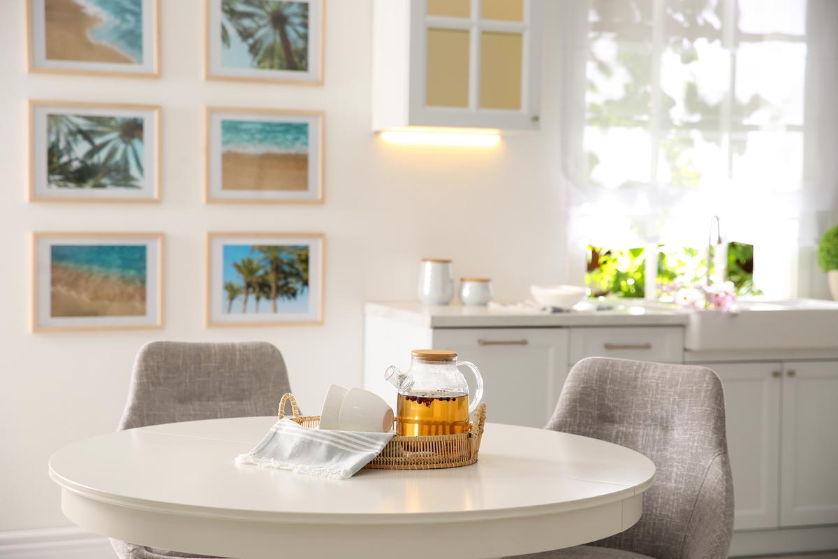
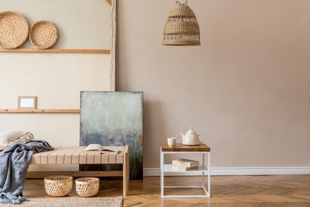
Everyone wants to have a little piece of the ocean near their home, be it a physical coast, a few shells from a recent vacation, or even photos of the beach. If you long for the beige sands and blue water of the coast, then a coastal kitchen should do the trick. Designing a modern coastal kitchen is far more forgiving than you think. You don’t need to have a sailor’s rope and a pair of lifesavers to pull it off.

To start with the interior needs to be bright. Even if you’re not using nautical blue paint for the walls, keep them white, since that is also a very coastal color. If you don’t want to paint your kitchen blue as you think that’s too bold of a color, then opt for blue accents instead. For example, a variety of blue plates and bowls on an open cupboard are a perfect way to accentuate the kitchen without it being overbearing. Even something as small as aqua blue salt and pepper shakers could also do the trick.

But you can’t simply achieve a coastal interior vibe solely through color. You also need some adornments to let your guests feel your love for the sea and the coast. Again, no lifesavers, boats in bottles, or wooden ship helms are required to pull this off. Get your hands on a bunch of different shells and place them around the place. You can fill a fishbowl with shells and beach stones to create a colorful decoration that reminds you of the coast. Also, white wooden planks are very indicative of an old-fashioned ship hull, so if you could use these planks to design an accent wall that could also work perfectly. 

3. Spanish Revival

A Modern Take on a Spanish Revival Kitchen

A Modern Take on a Spanish Revival Kitchen

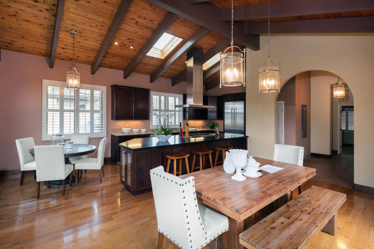
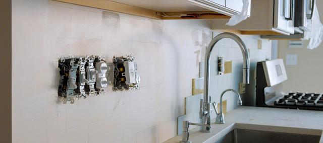
Spanish revival interiors are very organic. This refers both to the colors, textures, and geometry. You’ll see a lot of circular doorway arches, curved lines, as opposed to those straight edges that are found in contemporary kitchens, and lots of visual complexity, such as a colorful tile backsplash. What further gives Spanish revival interiors their characteristic charm are custom-made interior elements.

So, if you can go one step further and find hand-painted tiles to use for the backsplash, your vibrant interior will be that much more effective. Also keep in mind, that the more custom-made or hand-crafted interior elements you have, the higher the market value of your home will be. With each personalized interior adornment you implement, you’re essentially investing in your home’s value as well as its appearance.

One of the most prominent elements of Spanish revival interiors is the dark walnut wood surfaces. This can be the furniture, flooring, ceiling, or cabinets. Dark walnut pairs exceptionally well with terracotta hues of Spanish revival interiors, such as beige, orange, and rich reds.

Metal is also a big part of Spanish revival interiors. Whether they are metal cabinet and cupboard handles or a gorgeous kitchen chandelier, incorporate a bit of iron into the interior to make it more earthy. This earthiness is key to making your modern Spanish kitchen design pop out in all the right ways. 

4. Tudor
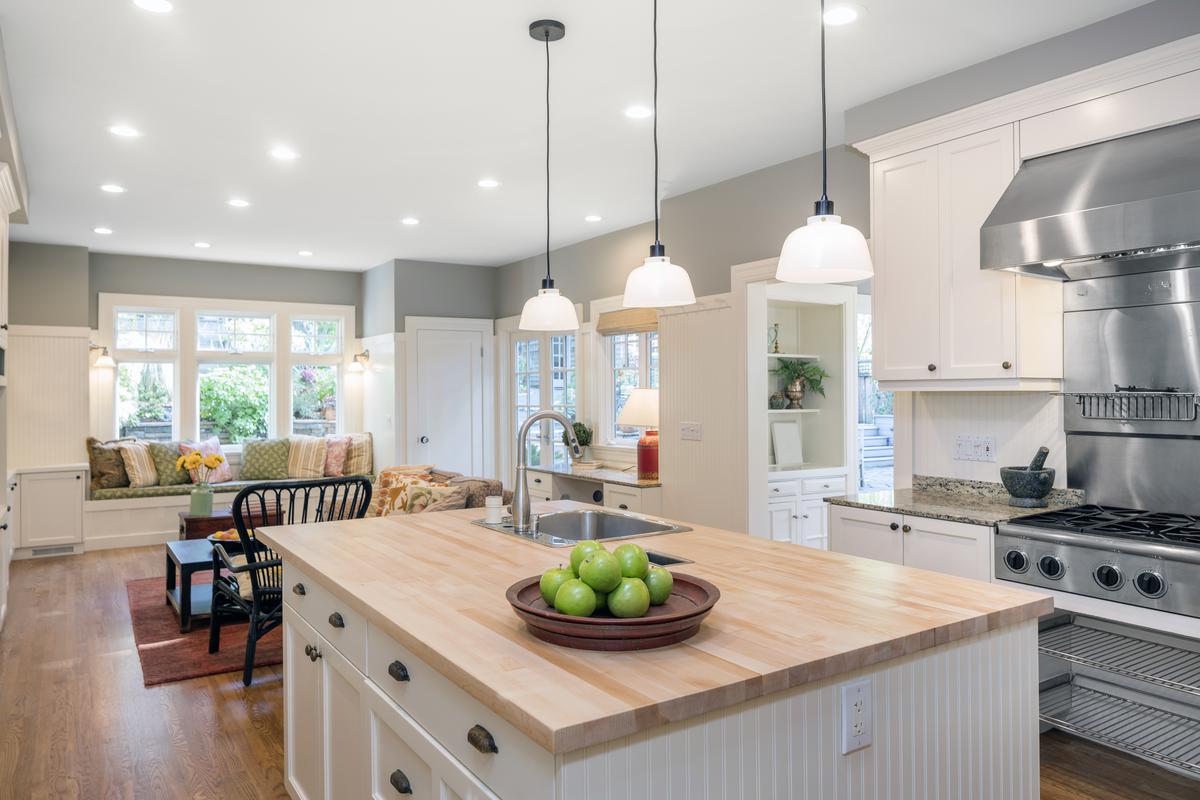
Contemporary Design Mixed with Classic Tudor Elements

Contemporary Design Mixed with Classic Tudor Elements

What happens when you bring an old-fashioned home design, like the Tudor, into the 21st century? Pretty much the same as any other traditional style that has evolved over the years to better fit into modern design preferences and habits. What this means is taking the most prevalent elements of an old design, keeping them, and minimizing or outright getting rid of anything that doesn’t belong in the modern kitchen.

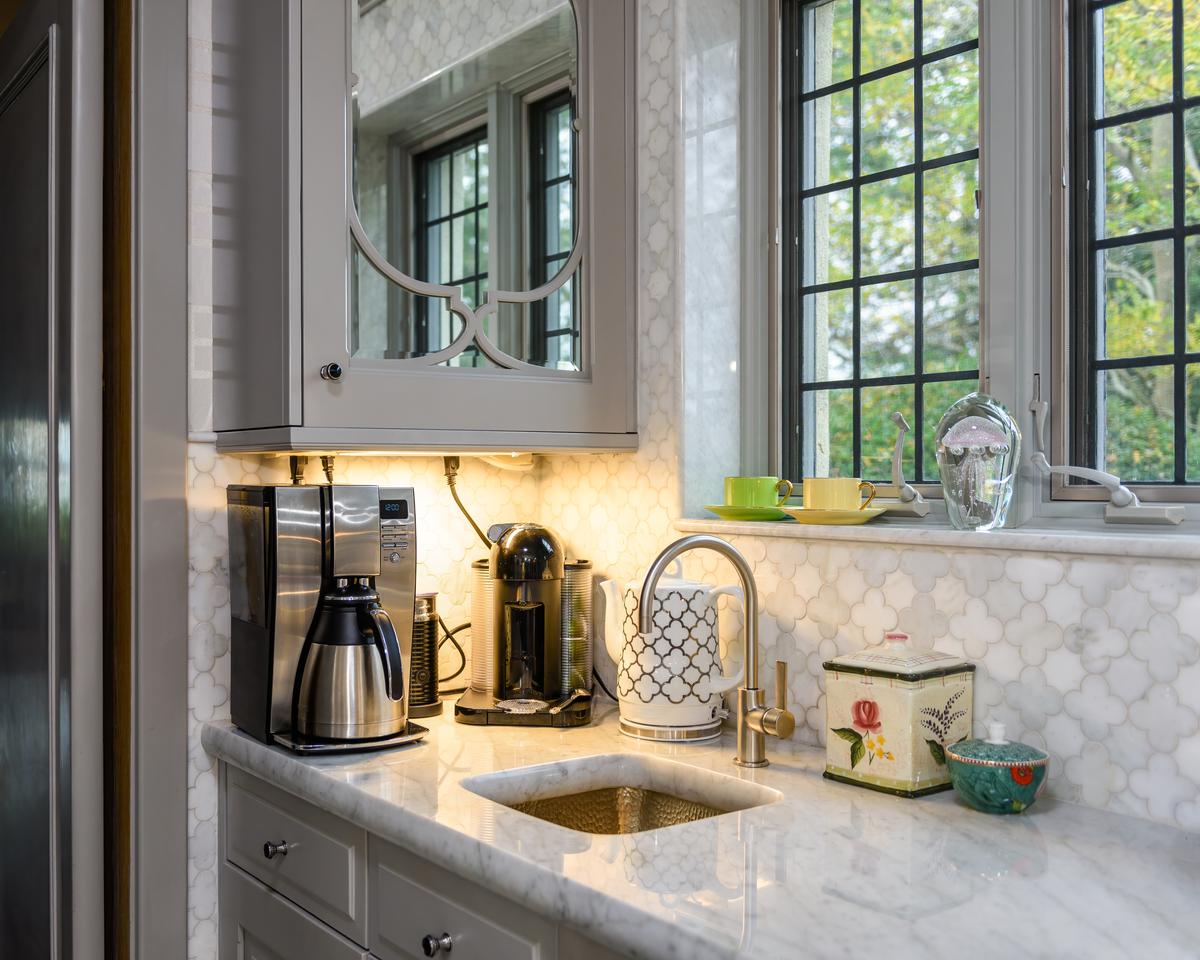
For example, a staple of 17th and 18th century home design are those wrought iron bars installed on the outside of windows. They were mostly there to protect the home from break-ins and robberies, but at some point became a stylistic addition. Now, you can install those wrought-iron bars on the outside of your windows, but that is a very bold design feature. So, if you don’t want to install those heavy wrought iron bars, you can instead opt for grey window frames.

Sure, these are not exactly those heavy iron bars, but the grey color does emulate something similar to them. This way you can implement this design element of having dark surfaces around the windows without metal bars physically obstructing the windows themselves.  So, you have sleek and modern-looking windows, which echo that distinct Tudor style, without the inconveniences that come with older home designs.

Another great way to implement old-fashioned interior elements into a modern Tudor kitchen is with a unique backsplash. Modern backsplashes tend to prioritize color and simple shapes over visual complexity, but you can add a bit of accent to your interior by using a ceramic tile backsplash with a complex pattern that imbues a sense of rustic charm into the kitchen without being too overbearing. But to retain that contemporary edge without letting the rustic Tudor elements outweigh the rest of the interior, use modern cabinetry under the backsplash to balance everything out. 

5. Transitional

The Sleek and Chique Transitional Kitchen Interior

The Sleek and Chique Transitional Kitchen Interior

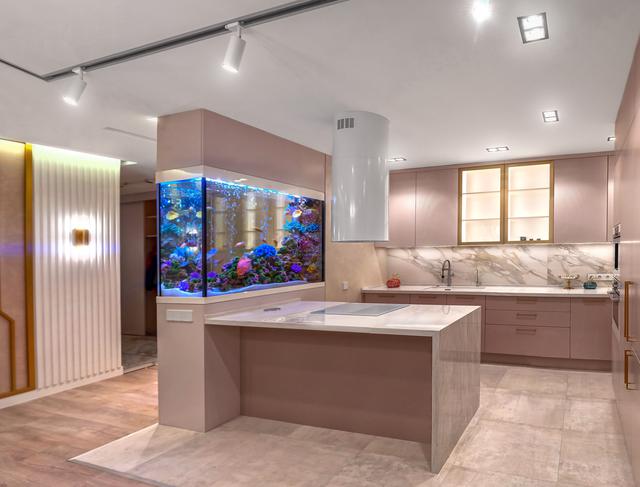
Modern transitional kitchens are quite popular nowadays and are a safe bet for many homeowners looking for something attractive and cozy, but not overcomplicated. Simplicity and minimalist design are a staple of transitional living and what makes these kinds of interiors work so well in contemporary homes.

Sleek surfaces are your number one friend when designing a transitional kitchen. This applies to the countertops, the cabinets, floor, walls, and plenty of other surfaces. You need to have visible sleek surfaces that resonate with modern interiors. You also need a few complex elements to break up the monotony of sleek modern interiors, such as a tiled backsplash or paneled kitchen cabinets.

But even in this case, complex visual details should take the backseat and let sleek minimalist interior elements take the wheel. In terms of color, transitional kitchens tend to be either bright or relatively neutral with a few accents, such as rich brown table legs or chairs. White and other bright colors should be doing most of the talking in the transitional kitchen, with darker hues here and there to break up the monotony.

AM

Written by
Alex Mikayelyan

Written by Alex Mikayelyan

None

comments